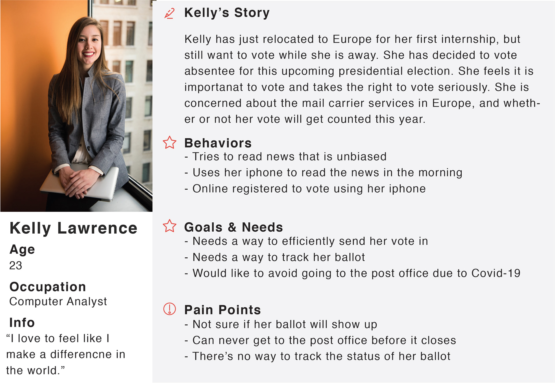
Persona
Based on our user interviews and determining our key insights, I worked with another member of the team to set up our persona.
Meet Kelly Lawrence!
We kept her in the forefront of all design decisions moving forward.
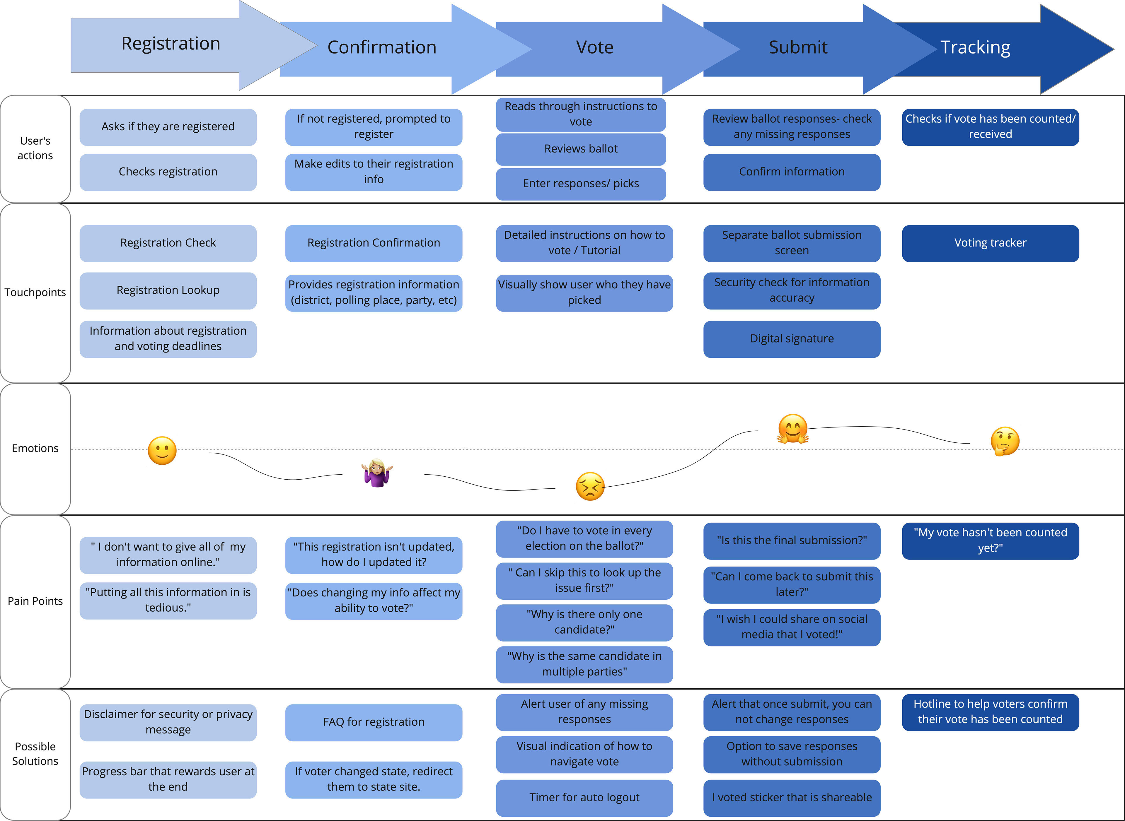
User Journey
Once I had developed our persona, mapping out the user’s journey was the next step.
By identifying the user's actions, touch-points, emotional state, pain points, and possible solutions we could brain storm what our user flow would look like.
Having this journey map was essential to the team to determine what areas would need more attention.
Kelly's Problem
Kelly needs a secure and seamless way to cast her vote while overseas so that she can ensure her vote is sufficiently received and counted in the United States elections. Because she is passionate about her civic duty, Kelly wants to feel like her vote makes a difference
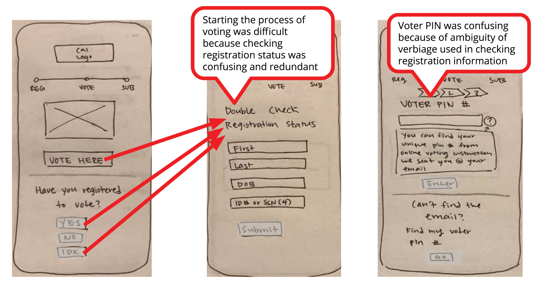
Sketch Testing
In our first iteration, we included the registration process in our flow since California allows same day registration.
However, with our testing we found that this was confusing the process for our users, so we scaled back and focused our attention only on the voting process.

Lo-Fi Testing
When conducting our usability test we learned that our users could navigate the registration flow easier and faster.
However, we saw them struggle to tap some of our hot spots. This slowed them down on key screens.
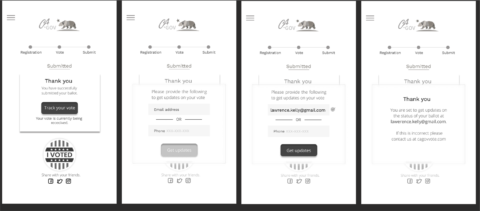

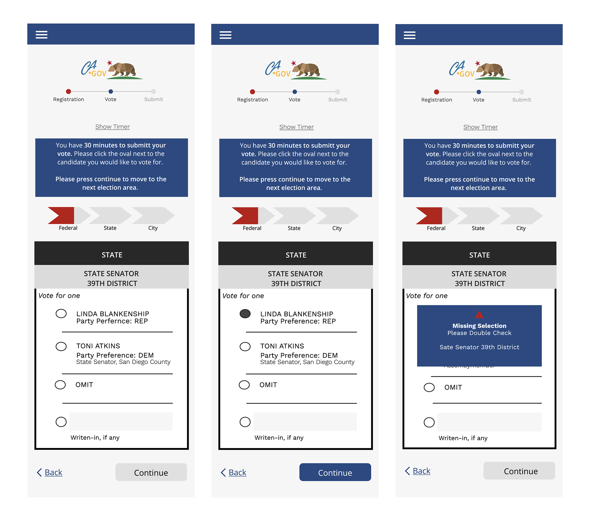
Hi-Fi Testing
In our final test for Hi-Fi, the changes we made through sketches and Lo-Fi lead us to a strong and intuitive flow for our users. This allowed them to navigate the confirmation process, select their candidate, and work through error alerts.
We did notice that some users took some unexpected paths during the registration confirmation, which eventually forced them to return to the home page. This is something we would like to test more to understand why they took the path they did, and if it is a trend.